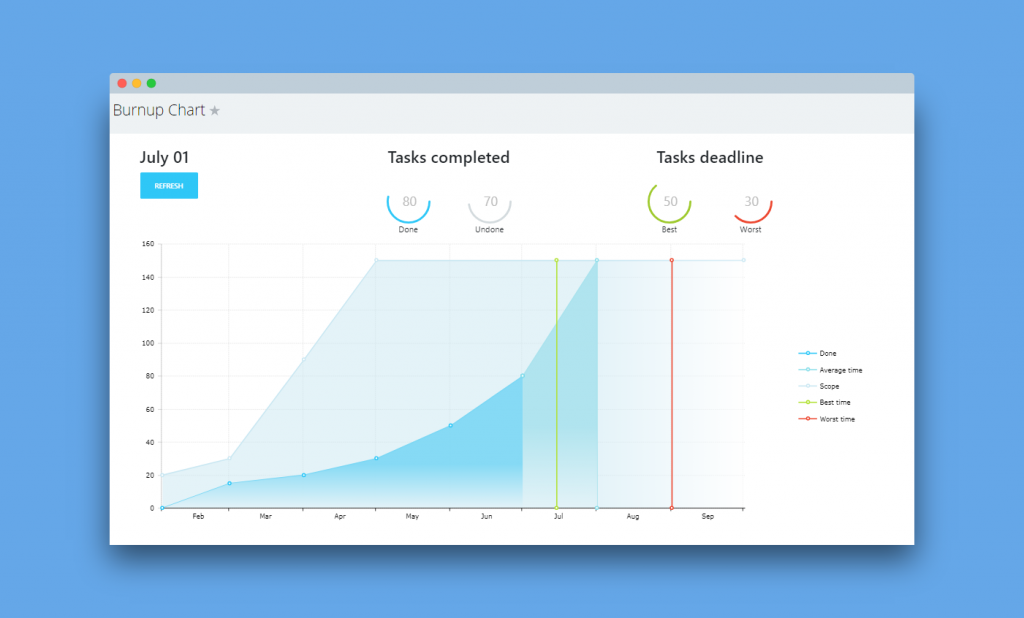
If you're involved in project management and need to overview project deadlines based on the number of tasks required to complete,
Burnup Chart app might be a perfect match. It works in real-time and let's you visualize the estimated time needed to finish a project.

There are two types of data that the graph builds upon:
- Y-axis: the number of tasks within the project
- X-axis: project timeline
The graph has five coloured lines and areas:
- Done – shows you a trend of completed tasks over a timeline
- Average time – a rough time estimate for completing all of the project’s tasks
- Scope – total number of tasks
- Best time – the estimated soonest date of completing a project
- Worst time – the time you are not expecting to exceed for project completion
Now, at any moment, you can view estimated time when a project will be completed.
Watch a quick app overview here.

